← All projects Client work · Website redesign · 2026

TN Pharma Website Redesign

TN Pharma makes 24 brands of medicine in its own Lahore plant. Its website made it look like a startup. I rebuilt it from strategy to code, so distributors, doctors and hospitals can see exactly what TN Pharma makes and how to buy it.

Client
TN Pharma, Lahore
Scope
Strategy, UX, UI and development
Timeline
Sept - Oct 2026
Live site
tnpharma.com ↗
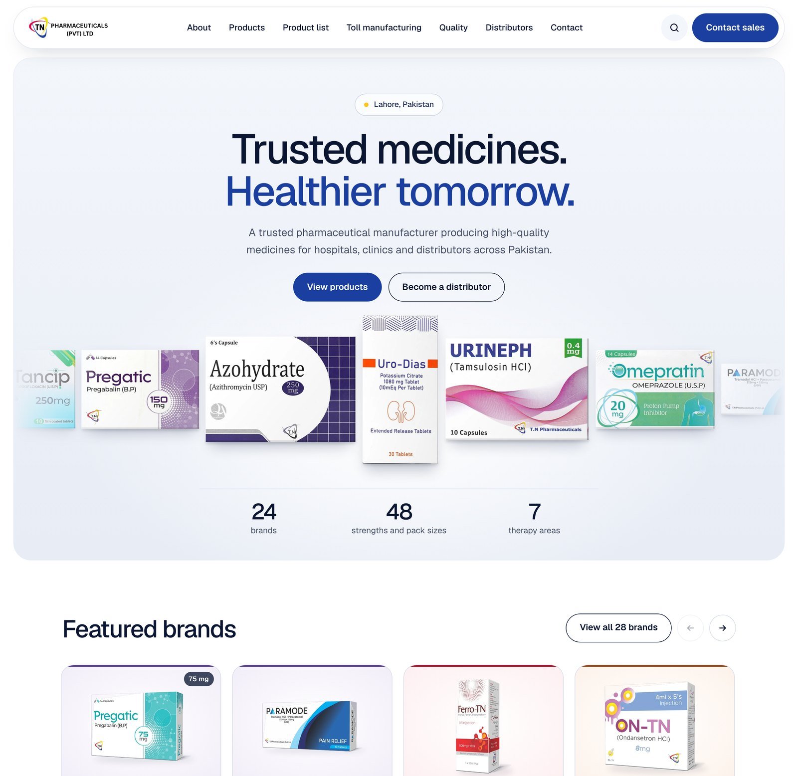
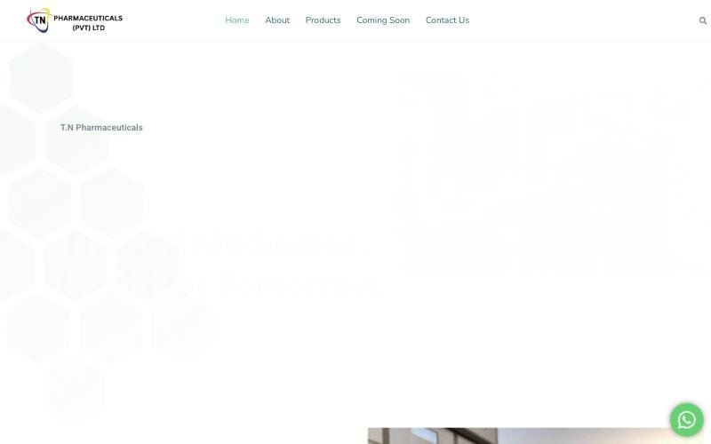
The new TN Pharma homepage with a clear headline, two buttons and a row of the company's own medicine packs The old TN Pharma homepage with a stock clean-room photo and no buttons BeforeAfter
Drag right to see the old site, left to see the new oneSame tagline. Everything else is new.

The outcome

5×Faster to load8.9 seconds down to 1.7
92%Fewer files to download79 down to 6
41Pages, up from 5Including one for every product
28Products buyers can searchUp from zero

Old site measured 29 Sept 2026, new site 12 Oct 2026.

The challenge

Buyers judge a supplier by its website. TN Pharma's was losing the sale.

Before a distributor or hospital buyer calls a manufacturer, they check its website. TN Pharma's showed them a stock photo, one paragraph and 23 image tiles. No licence, no plant, no way to search a single product, and no button to start a conversation.

The goal: make TN Pharma look as capable online as it is in person, and turn more visits into enquiries.

What I found

Four seconds of blank screen

The old homepage four seconds after loading, still almost blank0:04
01No reason to trust

No licence number, no privacy policy, no way to report a side effect. The footer credited the web agency, not TN Pharma.

02No way to search

Brand names and molecules lived inside images, some of them misspelled. Google couldn't read them, and neither could a buyer's search.

03No next step

Not one button on the homepage. Every product tile said the same thing: "Read more".

How I worked

From audit to launch in five steps

01Audit

Scored the old site on seven areas, from load speed to trust.

02Research

Studied 13 global pharma brands and 5 local rivals to learn what buyers expect.

03Structure

Mapped every page to one of three buyers: distributors, doctors or contract partners.

04Design

Built a design system from the logo, then reviewed mockups with the client.

05Build

Hand-coded the site. No WordPress, no plugins, nothing slowing it down.

Key decisions

Six decisions that changed the outcome

01

A homepage that sells in one screen

Visitors now see what TN Pharma makes before they scroll: its real packs, the numbers that matter and two clear next steps.

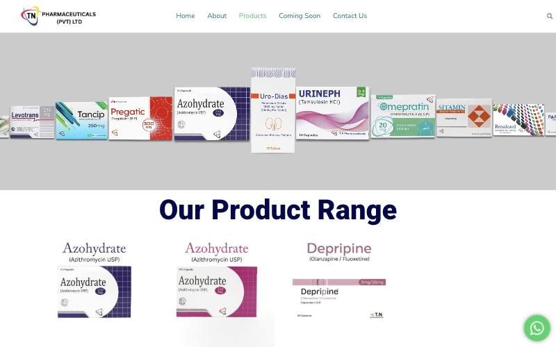
Before
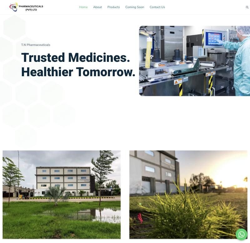
Old homepage hero with a stock photo
A slow fade-in, a stock photo and nothing to click.
After
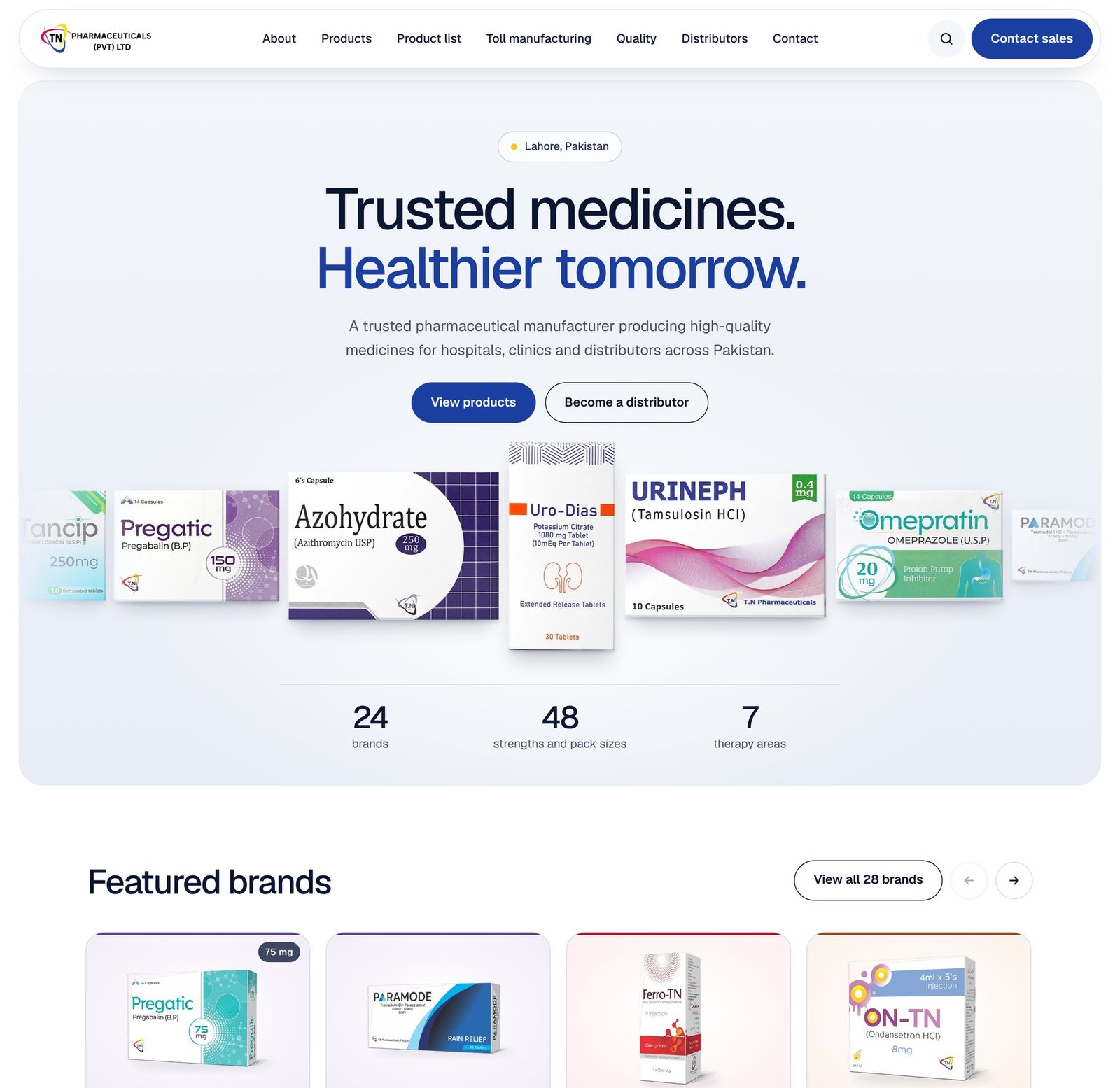
New homepage hero with TN Pharma's medicine packs and key numbers
TN Pharma's own packs, 24 brands, 7 therapy areas and two buttons.
02

Every product, one search away

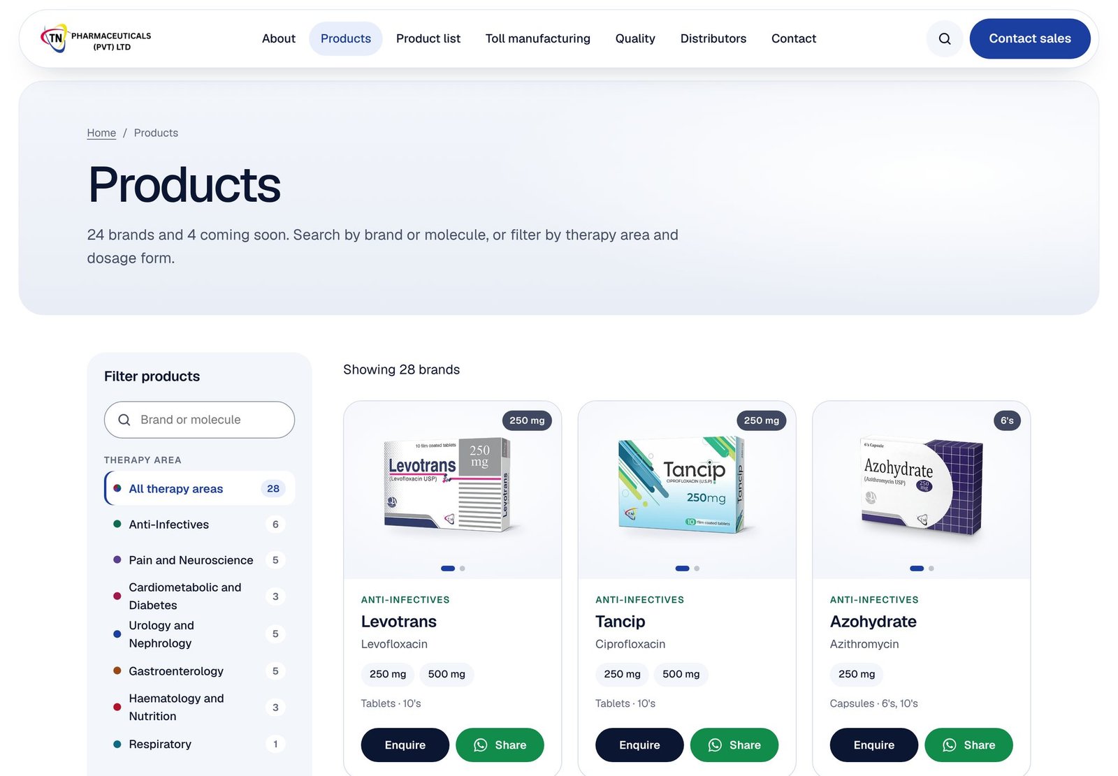
I rebuilt the catalogue as real text. Buyers can search by brand or molecule, and Google can finally index all 28 products.

Before
Old products page with identical image tiles and one brand shown twiceSame brand, twice
23 image tiles, one brand listed twice, no search.
After
New products page with search and filters
Search, plus filters for therapy area, dosage form and availability.
03

A page for every buyer

Distributors ask about supply. Doctors ask about prescribing. Contract partners ask about capacity. Each now has a page that answers them.

Before · 5 pages
Home
About
Products
Coming Soon
Contact Us
After · 41 pages
Distributors New
Healthcare professionals New
Toll manufacturing New
Quality New
Product list New
Sales toolkit New
Report a side effect New
Privacy and terms New
Home, About, Products, Contact
Coming soon is now a filter
+ 28 product pages, one for every product
04

Trust you can see

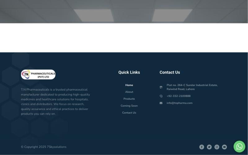
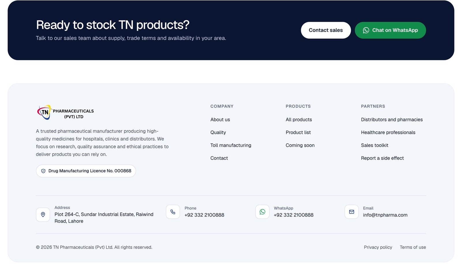
Hospitals only buy from licensed manufacturers. The licence number is now on every page, next to the privacy, terms and side-effect reporting a pharma company needs.

Before
Old footer crediting the web agency, with social icons that went nowhereAgency creditDead links
The agency's copyright and four social icons that went nowhere.
After
New footer with the manufacturing licence number and full contact details
Licence number, full contact details and side-effect reporting.
05

One clear next step

The menu names each audience, adds product search and leads to one action: Contact sales.

Before
Old menu with five links and no button
After
New menu with seven links, search and a Contact sales button
06

Fast, even on mobile data

The old site ran WordPress and an online-shop plugin for a company that doesn't sell online. The new one is hand-built and loads 5× faster.

Time to load Seconds
Old
8.9 s
New
1.7 s
Files downloaded Requests
Old
79
New
6
Page weight on arrival Kilobytes
Old
~1,600
New
277
Design system

One system, taken from the logo

TN Pharma's red, blue and yellow became the palette. One typeface, Geist, keeps everything from headlines to dose strengths easy to read.

TN Pharma logo
InkBlueRedSunSoftSlate
Typeface · Geist
AAEvery text colour passes the accessibility standard
16 pxSmallest body text, so doses read clearly
44 pxSmallest tap target, for thumbs on phones
The result

The new tnpharma.com

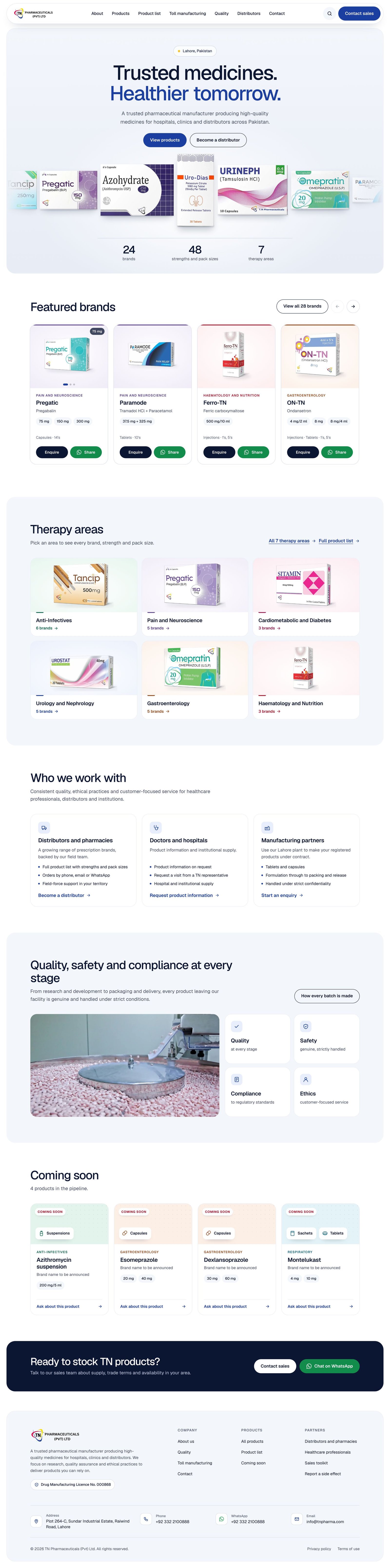
Scroll inside the frames or press play to see the full homepage on desktop and mobile.

tnpharma.com
The complete new TN Pharma homepage from top to bottom
The new TN Pharma homepage on a phone
Work with me

Is your website underselling your business?

If your company is better than its website, I can fix that. I handle the strategy, design and build, and you get a site that brings in enquiries.

Get in touchMore projects
← All projects Next: $30K+ Product Campaigns →